
Gauges - the eye candy of data visualization
When I first started thinking about this post, it was titled "Why I hate gauges". And then Ed added a gauge to the Pricing Insights dashboard, and I nearly divorced him for ruining my blog. But we're still married, so let me take you on the journey that led to that outcome.
Remember the first time you saw a gauge on a dashboard? Of course you do, because it was unlike any chart or graph you'd ever seen before, and that made it sexy! You either wanted to marry that gauge and show it off to everyone, or destroy it for being the prettiest one at the prom. Or maybe you felt a little bit of both, like I did. So I looked at it some more, and realized I didn't quite understand it, which made me think for a moment that gauge was smarter than me. And then I looked at it again, for several minutes, and then several minutes more, and then I decided that I hated that gauge. Turns out I did understand it. But being a bit of a data visualization purist (yes, I've attended whole conferences on just data visualization!), it was very obvious that gauge, through no fault of its own, was one of the worst ways to visually show that particular metric. And ever since that first gauge came into being, more and more of them have appeared, and mostly used in the same horribly wrong way.
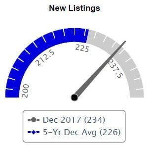
Here's an example of the gauge which most grievously offended me. First off, though it could be considered a minor detail, how is it possible to have 212 and a half listings? No, really, I want to know. Honestly it seems just plain lazy to have a label like that on a chart, unless there's an agent out there willing to take half commission for that half of a listing. Now let's look at the scale. It starts at 200 for some unknown reason, and ends at an equally arbitrary unseen number, possibly 250? From the legend, the blue bar is an average. If the endpoint is 250, the middle/average should be 225,but I would expect it to be in the middle of the gauge instead of where it is past the middle. So the numbers are all off kilter where they should be, making me trust this picture even less. Lastly, I can see the Dec 2017 number is higher than the 5 year average - but is that even a reasonable comparison to make? Who looks at today's number in relation to a complete 5 year average?? Nobody, that's who. Unless they get stuck looking at this gauge. Personally, I think a nice line chart across 5 years tells a more clear and easy to read story about new listings. Besides, do you really want to have to explain this gauge chart to every buyer or seller out there?
Now that you know what a bad gauge visualization looks like, let's talk about what a gauge should be. Think about your car for a moment. There are several gauges on the dashboard. They tell you if you're going fast or slow, if your tank is empty or full, if your RPMs are high or low (I almost sound like a car person with that last one, right?). The point is, they are all a single measure of something. In a quick glance, you know the answer to your question. This is what gauges were meant for. They weren't meant to be compared to other sets of data or display trends. Imagine if the speedometer and the gas indicator were a single gauge on your car and what that would be like for you as the driver. I don't want to drive that car.
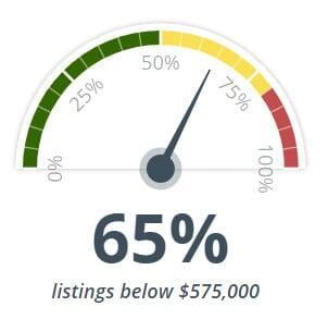
Which brings us to the gauge that saved our marriage. The scale is correctly set from 0-100% (or from empty to full if you're still thinking about cars). The halfway point is clear both in label and in color. In one glance, you can see it's communicating that something is at 65%. In the context of our Pricing dashboard, $575,000 is the proposed listing price of a property, so the gauge shows that 65% of the listings in that market are less than that amount. We're not obfuscating any metrics or numbers in aggregate formulas thrown onto the gauge. We aren't showing only listings between 48%-78% so you feel better about that 65% number. Instead, it's a clear and concise picture that shows where a single property is relative to all the other properties in the overall market.
It's beauty is in its simplicity, and its simplicity makes it incredibly useful. If there's one thing you take away from this, I hope it's the ability to recognize the poor communication skills of that first silly gauge trying to play in the wrong sandbox, and to appreciate the gauges that stick to their one true purpose and build the most beautiful sand castles. Those are the gauges I don't hate.